Press for navigation
Swipe for navigation

Blueprint

Discover CSS snippets to improve font smoothing, text clamping, and navigation styles with Merge.dev's blueprint.

Website Builder Updated 1 hour ago
Visit Website
Blueprint

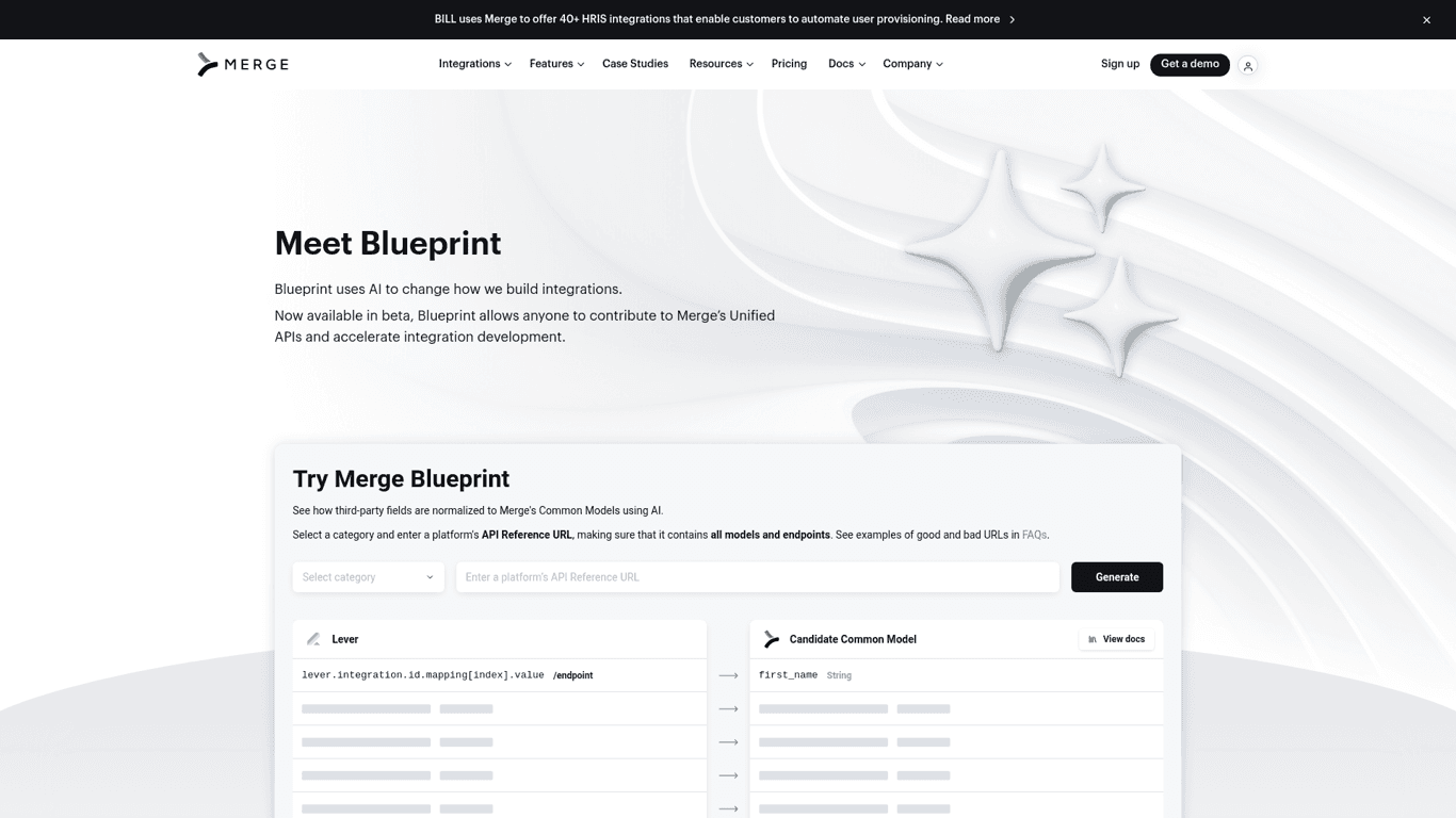
Blueprint's Top Features

Font smoothing for enhanced legibility
Responsive container width and padding
Text clamping for controlled text overflow
User selection and pointer events disabling
Apple form styles reset
Navigation dropdown bug fixes
Retina/hidpi display adjustments
Adaptive blog layouts for different screens
Pointer events adjustment
Consistent text truncation

Frequently asked questions about Blueprint

The CSS snippets are designed to improve web design and enhance user experience by providing styles for font smoothing, text clamping, container width adjustments, and more.

To use the font smoothing styles, add the specified CSS properties to your body tag to make text look crisper and more legible across all browsers.

Text clamping limits the number of visible text lines and adds an ellipsis ('...') after the specified number of lines, creating a cleaner layout.

Yes, by using the '.disable-select' class or '.u-disable-select' class, you can prevent users from selecting text elements.

You can reset Apple form styles by applying the provided CSS properties to input, textarea, and select elements, which remove the default appearance and styling.

Yes, there are specific styles for navigation dropdowns to prevent transforms, manage display on different screen sizes, and adjust colors upon hover.

Retina/hidpi rules are CSS styles applied to high-resolution screens to ensure elements like borders and icons appear crisper and properly aligned.

Yes, there are media queries provided to adjust blog layouts for different screen sizes, such as setting blogs to one column or hiding posts for better responsiveness.

CSS media queries are provided to adjust container padding based on screen width, ensuring proper spacing on smaller screens.

The '.truncate-width' class ensures that text elements do not overflow their containers by truncating and adding an ellipsis ('...') when the text exceeds 100% width.

Customer Reviews

Login to leave a review

No reviews yet. Be the first to review!

Top Blueprint Alternatives
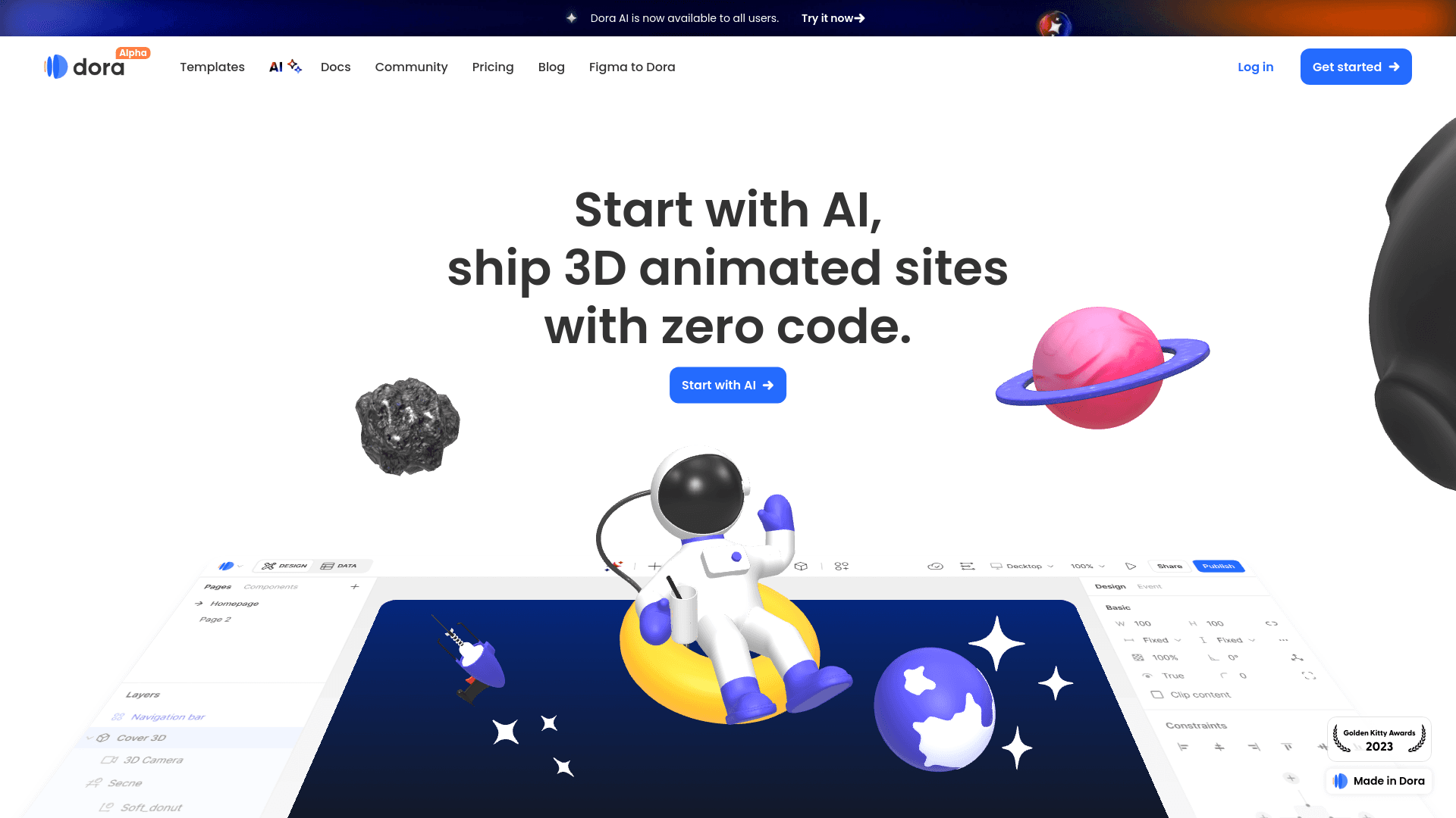
Dora

Discover Dora AI, the no-code platform for 3D animated websites using AI-powered design.
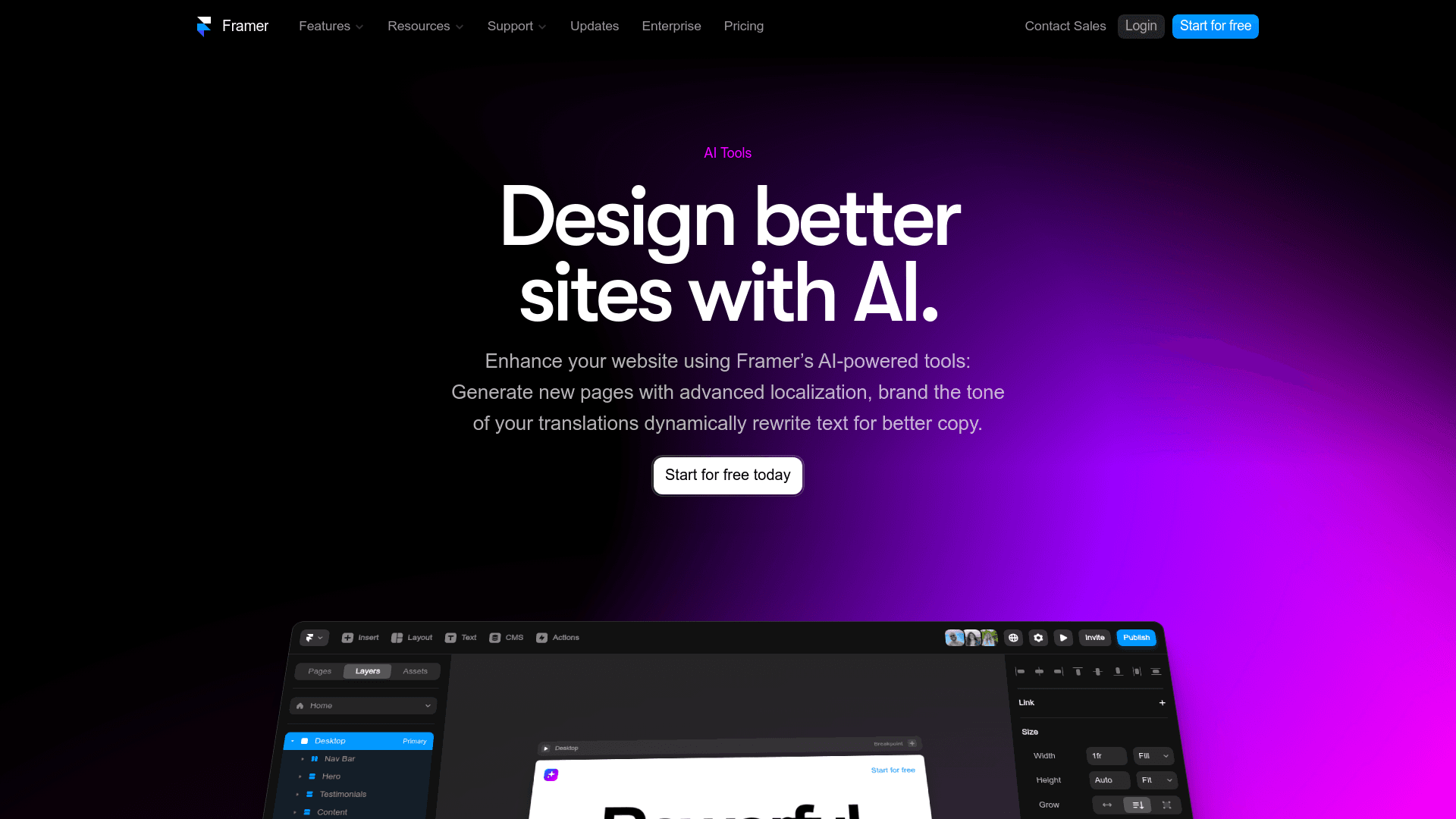
Framer

Discover Framer's AI website builder for easy multilingual support, content rewriting, and brand ton...

Turbologo

Authenticate with ease using Facebook or Google on Turbologo. Manage accounts, recover passwords, an...
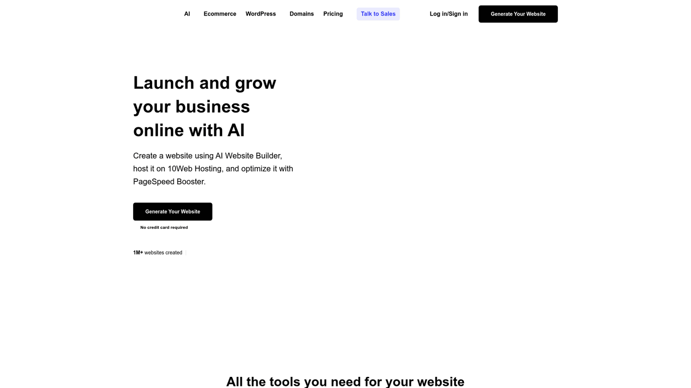
10Web

Create a tailored, mobile-friendly website in minutes with 10Web's AI Website Builder. Easy drag-and...

Wonder Dynamics

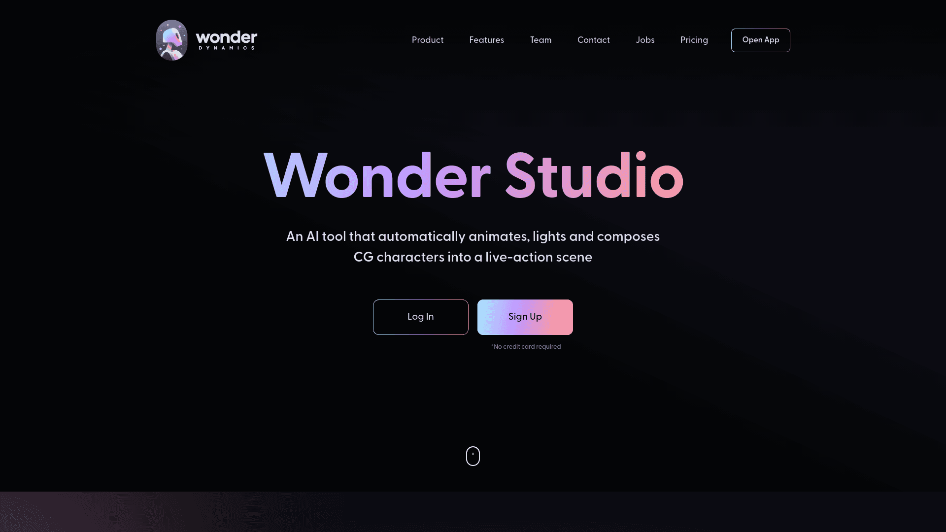
Learn about the types of cookies used by Wonder Dynamics for enhancing user experience, including fu...
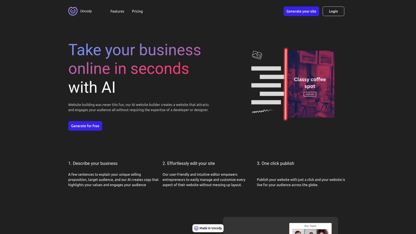
Unicody

Create your online presence quickly with Uncody's all-in-one website building platform.

Prev Project
Next Project